May 18, 2021
5 Things to Remember When Designing Your Luxury Real Estate Website
When it comes to luxury real estate, your website is everything. It showcases your homes, gives your brand a voice, and allows wealthy homebuyers to envision a future in your community.
Think of your luxury real estate website as a 24/7 salesperson — it’s working around the clock to move potential buyers through the funnel and make it impossible for them to picture living anywhere else. The real estate market is booming, and now is the perfect time to redesign your website to take advantage of it.
As you consider updates to your luxury real estate website, remember these five tips to help ensure your brand is targeting the right buyers.
1. Stunning Imagery and Creative Design
What’s the first thing you notice when landing on any website? We’re willing to bet it’s not the menu structure or about us paragraph — it’s the imagery! When someone lands on your website, especially the affluent buyer who has standards of what to expect, you need to make your first impression count.
Homes that feature high-quality photography sell 32% faster than those with unimaginative photography, and it’s no surprise why. As the modern home search sways more into the digital sphere, people need to be able to picture themselves in a home. They want to virtually interact with their future forever home.
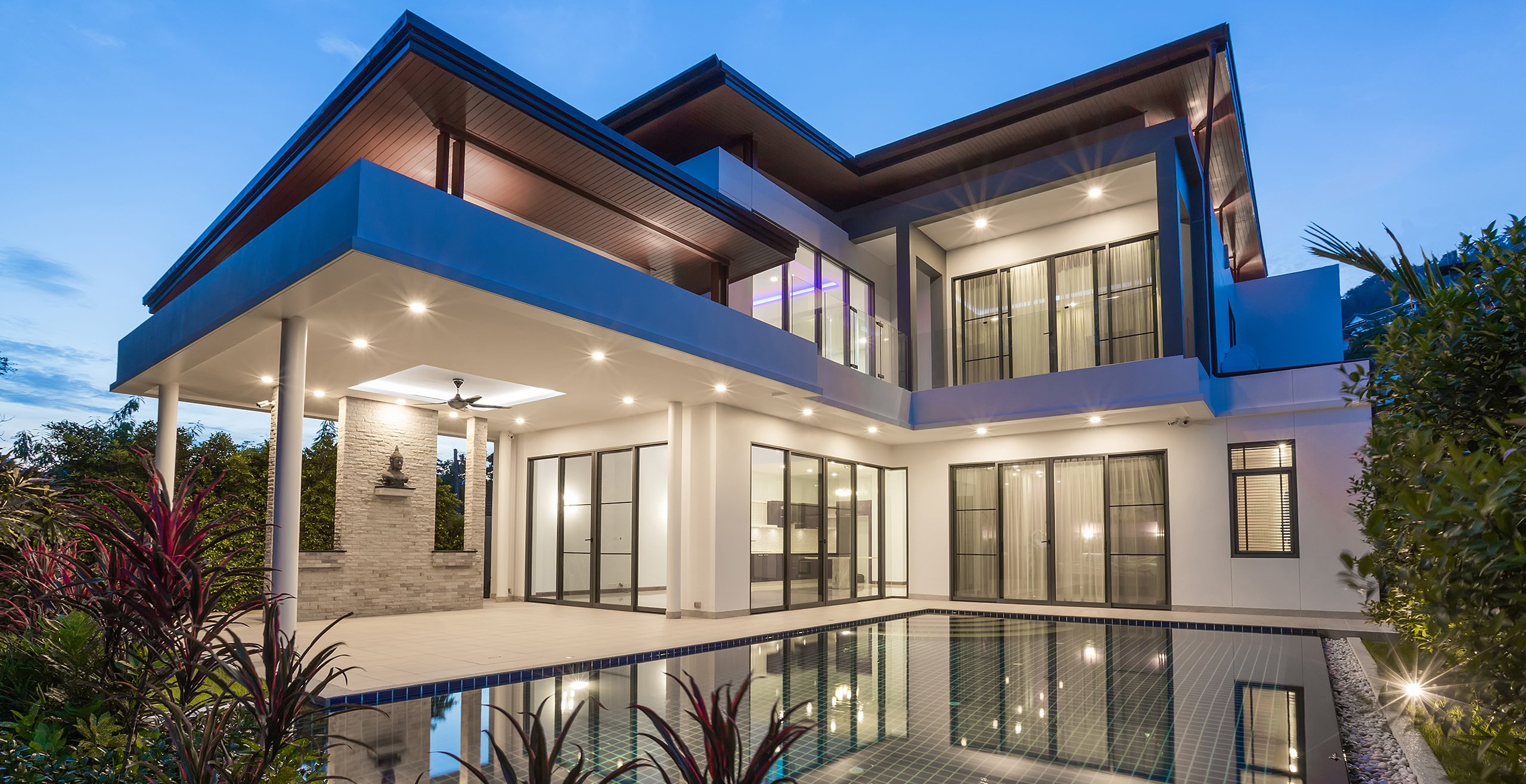
Whether it be high-end finishings, backyard amenities, or entire floor plans, your imagery should evoke a sense of luxury. Paired with creative design elements — infographics, floorplans, 3D tours, and virtual showings, etc. — this allows you to make your first impression count.
2. Social Shareability
Social media has many purposes when it comes to home buying. From showcasing your homes and communities to interacting with and building trust with prospective luxury buyers, social media has the potential to drive sales for your brand.
Because of this, it’s crucial that your site is optimized for social shareability. Have you ever come across a blog post or home listing on your favorite social media platform and noticed the featured image is missing, pixilated, or clearly not professional photography? This comes across as lazy, unprofessional, and immediately downplays your image, desired quality, and value of your brand.
Sites that are unoptimized for social sharing could actually be turning away customers rather than inviting them in. Remember, social media is often a status-boosting opportunity for many people looking to share their luxury communities with their network, so make sure your images and designs are ready to be seen.
3. Minimalistic Design
Affluence and minimalism often go hand-in-hand. A minimalistic website design can appeal to affluent buyers who prefer sleek, modern homes. When thinking about some common aspects of minimalist home design — earthy tones, straight lines, open spaces — it becomes easier to incorporate similar design elements into your website.
Here are some basic tips to remember to keep your website as modern as possible and appeal to luxury buyers:
- Simple Menu Structure — When a wealthy buyer lands on your site, make it easy for them to find what they are looking for. Simple menu structures like “Company Name — Gallery — Models — Contact” explain exactly what a visitor will find.
- Branding — Creating a real estate brand is among the most important things you can do as a luxury builder. Colors, logos, and brand promises should be opulent enough to hook luxury buyers without distracting them from your homes.
- Concise Photography — While stunning imagery is vital for your website, it’s also important to remain organized. We know you likely have breathtaking creations you want to share with visitors, but crowding the homepage with them is not the answer. Save full galleries for your gallery page and keep your homepage simple, sophisticated, and easy-to-navigate.
4. Luxurious Storytelling
Storytelling is a crucial aspect of real estate marketing for builders and developers of all kinds, but the language that luxury buyers expect is vastly different from non-luxury. Sophisticated language should be sprinkled throughout your site to further appeal to the psyche of luxury buyers.
Descriptors such as “abundant open space,” “magnificent architecture,” and “luxurious details” are more likely to catch an affluent buyer’s eye. They expect these features and many more in their homes, and when you reinforce on the website what they are getting, you have a better chance to make a favorable impression.
5. Browsability
People likely don’t land on your site by accident. They intentionally click an ad, open a blog, or search on Google with the intention of finding their next home. At the very least, they come to your website looking to learn more about the builder who could be the solution to their specific needs.
When your site is not browsable, it becomes incredibly difficult to keep potential buyers interested and convince them that you are the builder of their dreams. If you’re a custom home builder, prioritize your gallery of unique options that they can choose from. If you’re looking to sell your luxury community, make it easy for buyers to browse available floor plans in the community.
This focus on user experience allows visitors to stay on your website longer, learn more about your brand and history as a builder or developer, and ultimately encourages them to connect for a showing. It should be simple for visitors to request information on homes, contact your office, and schedule a tour.
Partner With the Experts in Luxury Real Estate Website Design
At Milesbrand, we pride ourselves on luxury home builder marketing. It takes a partner that truly understands the motivations behind luxury purchases in order to craft a message that caters to that buyer’s needs.
Our creative design and branding experts are ready to help you design a luxury real estate website that appeals to your target audience. Get started with a consultation today!


