July 06, 2022
6 Modern Home Builder Web Design Best Practices
To maintain a competitive edge in today’s housing market, an exceptional website is a must for every home builder. Your website is often a potential buyer’s first impression of your brand, so your home builder web design will need to grab their attention right away.
Today’s consumers have unfettered access to the internet through their smartphones — among a million other devices – and that means attention spans are shorter than ever. In fact, more than half of a site’s visitors will leave after 15 seconds or less.
To combat this, you need a website that’s not only going to effectively capture buyer attention but is going to keep them there long enough to absorb what you have to offer. Of course, you need a visually stunning design with strong branding, but you’ll also need a site that’s highly functional, engaging and provides real value for the visitor. Designing an engaging website that accounts for these decreasing attention spans ensures that your visitors will be more likely to convert.
The information your website provides needs to entice visitors to take the next step in the homebuying process, whether that’s taking a virtual tour or scheduling an in-person meeting with a member of your team. Builders may view their website as an online portfolio, it also has many other important capabilities if the domain is designed well. With a strong design, home builder websites can effectively serve as an outstanding generator of leads and sales.
Every high-quality home builder website has certain key components in place to drive conversions. Now more than ever, a well-structured website that leverages proven marketing concepts is essential to help you stay ahead of your competition.
How does your home builder website design measure up? Find out by taking a look at the web design best practices that every home builder should be using.
1. Consistent, On-Brand, and High-Quality Imagery
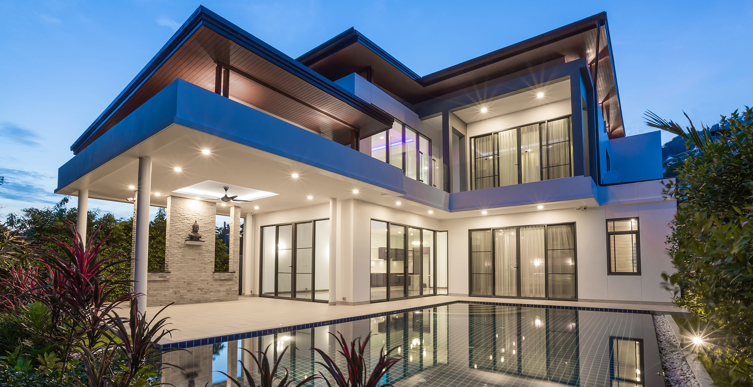
As a home builder, showcasing your new home portfolio on your website is essential. Don’t miss opportunities to place images of your homes front and center on your website! When potential homebuyers start browsing for builders, the first thing they are drawn to is the way the homes look. Sure, they’ll also need to consider the homes' technical specifications, but ultimately, if they don’t like what they see, they’ll move on to something else.
Promoting new homes requires a highly visual approach that caters to the emotional aspects of homebuyer decision-making. Homebuyers are most drawn to home builder websites that are filled with high-quality visual content including images, 3D renderings, videos and more.
Real estate is an industry driven by aesthetics, so you’ll need to keep this concept at the forefront of your web design strategy. Highlighting imagery from your new home portfolio allows buyers to gain an understanding of your versatility, craftsmanship and design capabilities. Be sure to choose images of high quality that show off your design range.
When choosing imagery and design concepts for your site, it’s important to be consistent. Instead of trying to cobble together mismatched graphics and stock images, you should first develop a brand identity. Strong branding design that is showcased well helps differentiate your company from competitors while also enabling you to more easily target potential customers who align with your brand’s vision and values. With a well-made brand, you'll have guidelines for almost every design decision you'll face.
For example, part of branding includes choosing a color palette. From there, you'll already know that photos and graphics need to reflect that color palette. Fonts and other design elements should also be consistent throughout the entire site and align with your brand’s visual identity.
The result is a streamlined experience for your site’s visitors that immediately clues them into who your brand is and what you have to offer. Quality is everything when it comes to your imagery, as it really determines the first impression that visitors have of your business.
True Homes, one of our outstanding home builder clients, is a great example of cohesive branding and imagery. This brand utilizes a consistent color palette and features photos and graphics that boldly convey the builder’s personality.
2. Copywriting That Tells A Story
One of the biggest web design mistakes home builders make is thinking of the copy as an afterthought. While quality imagery acts as the initial pull for your visitors’ attention, engaging copy is what keeps them on your site and entices them to continue learning more about you. Professional copy should be one of the most serious considerations you make when constructing your website.
Instead of flatly stating facts about your company, your website should include appealing copy that visitors enjoy reading. While your copy should provide plenty of information, it shouldn’t be dry — you’ll want your brand’s voice and personality to shine through.
The information on your website needs to sound professional, but it also needs to resonate emotionally with visitors — that’s what’s going to increase your conversions. Copywriting that tells a story is memorable and can set you apart in a field of competitors.
3. Effective Layout and Formatting
When it comes to the quality of the websites they visit, consumers today have high expectations. Your site should be smooth and easy to navigate so visitors can quickly find what they’re looking for within those crucial first few seconds. The website homepage should seamlessly and instantaneously deliver your company’s core message. If your website design is confusing or disorganized, buyers will be quick to exit and continue browsing other home builder sites to find the information they’re hoping to find.
The most important aspect of your home builder website design is the menu, which should be prominent and easily accessible. You’ll need to make sure users see it right away and that the links they’re looking for aren’t hidden by unrelated content or imagery. Try not to clutter the website menu by only including tabs that are most essential to the user experience. Menu options could include About Us, Services, Portfolio and Contact Us pages.
To put together the most effective layout for your buyers’ needs, it’s crucial to develop an understanding of what your visitors are actually looking for. The less that visitors have to read or click on to find the information they need, the better. Luckily, there are plenty of digital tools that you can use to better understand what’s most important to your customers.
Start with analytics. If you have a live website, you can use Google Analytics to know which pages on your site get the most views as well as the places where your customers spend the most time. This tells you what buyers are looking for, as well as where your site is successfully attracting visitor attention. Builders can leverage this information to improve their site and use the success of certain pages to better understand buyer interests and needs.
You can take things further by using a website heatmap tool like Hotjar, which shows you how users move, scroll, and click through your pages.
4. Mobile-Friendly Design
Over 50 percent of web traffic comes from mobile phones, and that number is only increasing year over year. Many people are finding new websites through social media apps or other mobile channels. That’s why it’s more important than ever to have a website that looks just as great on mobile as it does on a desktop. A great practice is to build and test your mobile site view at the same time as you develop or update the desktop site view, instead of having to convert to a mobile-friendly design later on.
Mobile-optimized sites must be fast, sleek, and simple to effectively engage users. Busy visitors don’t have the patience to comb through your website or wait on a slow loading time to find the information they need. Studies show that enhancing the speed of a mobile site results in both increased conversion and lower bounce rates.
When your website design is optimized for all users, its visibility to potential buyers increases. Mobile-friendly sites gain a potential ranking advantage, as more and more Google searches are conducted on mobile devices. Delivering a website that performs well on both mobile and desktop devices ultimately provides a better user experience, which is an important factor prioritized within Google search engine result ranking.
5. Virtual Tours
A combination of current events and advances in technology have changed the way that people shop for homes. Prospective buyers don’t want to wait until an in-person showing to see what your homes have to offer. They want the immediacy of a virtual tour that they can easily access from wherever they are.
In just a few years, virtual tours have gone from being an optional add-on to a must-have for any successful home builder’s web design. Today, whether or not you offer virtual tours on your home builder website has become an indicator of your brand credibility. Buyers expect the best home builders to provide access to virtual tours, and those who don’t will quickly become a short stop on the way to finding better home builders who keep up with evolving buyer expectations.
Virtual tours give your visitors a taste of the design and amenities your homes have to offer without ever leaving their couch. They also give your brand a sense of professionalism and show prospective buyers that you value providing a stellar customer experience.
When putting together a virtual tour, it’s crucial to invest in professional photography or videography. This professional approach will ensure you capture every detail of your company and homes in the best quality possible.
6. Testimonials
Building trust with your potential buyers is essential, and one effective way to do this is by featuring customer testimonials on your site. Testimonials give your brand credibility because they come from an unbiased source that shares goals and values with your potential buyers.
Building a new home is a significant step for many families, both emotionally and financially. Choosing the right home builder is a highly important and potentially intimidating decision, which means homebuyers are especially cautious during their search. Builders with little to no online reputation or reviews, are much less likely to be considered among potential buyers.
For many visitors, a glowing testimonial could provide that extra push to take the next step. In fact, studies indicate that 84% of consumers place as much trust in online reviews as they would a personal recommendation.
To provide a clear understanding of your company’s commitment to excellent customer service, your website design should include a testimonial page. Complete this page by habitually asking existing clients to provide written reviews detailing their experience with your team and be sure to highlight concise, diverse statements. For the most effective testimonials, make sure to include an image of the mentioned customer’s completed home, or even consider shooting a video testimonial. This visual element makes the testimonial more relatable and strengthens your site’s emotional connection with buyers.
Represent Your Brand with a Strong Home Builder Website Design
Home builder web design is arguably the most important part of your marketing strategy. A well-designed website is a digital representation of your brand and will resonate with your customers to drive conversions and strong sales. This online asset can be used to showcase your best work and help buyers understand the full extent of your company’s capabilities.
We offer specialized branding and marketing services for home builders, which includes a comprehensive overhaul of your digital footprint. Contact us today to learn more about how we can take you from land to brand.


